Sunday 31 July 2011

Pretty Flower Girl

I was recently requested to make a number of cards by a bride to be. I thought it was such a lovely idea of hers to ask her bridesmaids/maid or honour and flower girl by giving them a personalised card inviting them.

Here's the first one - the flowergirl card (I'm posting tis one because the recipient is too young to check it out!) hehe I will post the rest once I give the order to the lovely bride.

EDIT: OK - for some reason today, everytime I'm adding a photo to blogger it's posting them sideways. So i thought I'd be clever and rotate them in paint - except miss not so clever has just discovered that it's a mirror image. Have nO idea what's going on, but will attempt at some later stage to re-post! hopefully you get the idea....

The card base is papertrey ink. I love how thick their cardstock is. My SU Whisper White was too flimsy. Lovely to stamp on, even better to print on (since its the only cardstock to go through the feeder in my printer) but not so great for a card base. The pink is SU pretty in pink and the white insert was run through the big shot with a cuttlebug embossing folder called [I think] life script.

The little dress I sketched out onto cardstock in pencil, cut it out and used the Faux Silk  technique on it by stamping En Francais in pink on tissue paper, scrunching it all up [reminder - wait till dry!!!] then gluestick the surface of the dress, lay tissue on top, careful not to smooth away too many wrinkles, and cut around. viola - imitation fabric! a scrap of ribbon and some bling and she was done!

I made a second one at the same time for the envelope....

I just stuck it up on some dimensionals as I did with the one on the card front.

Oh, and the ribbon bow was hand-tied. Yes-I-have-exhausted-you-tube-till-I-got-it-right. hehe

Well hope you like it, and most importantly the bride and flowergirl love it!

Cheers,

Wednesday 20 July 2011

Out of the comfort zone....

Hi All ... (or should I say favourite few?)

Today, I'm featuring my most recent creation who's inspiration came from THIS image and latest Just Add Ink Challenge, and the colour combination came from The Summer Card Camp Week 4 challenge. Talk about two complimentary challenges! (mind you I just missed out on linking this to Just Add Ink by 45 min!)

This one is more than a little out of my comfort zone .... Firstly, it's in blues and greens, secondly it involves acrylic paint, and thirdly its all shimmery! So without further ado:

Ok - apologies for the REALLY bad photo (taken at 10pm on the kitchen bench). I could have sworn it looked better on the laptop, but alas no! Will take another and replace this weekend.

The image itself is actually the Hero Arts music background stamp embossed with Versamark onto glossy paper with white embossing powder. Since I never use glossy paper, I cheated and used HP photo paper, it's thinner than the usual glossy cardstock, but when mounted it does the job!

The only colours I had in ink pads was SU Baja Breeze and Kiwi Kiss, I had nothing else really remotely similar. So I cracked open some old little acrylic paints that were in a 24 mini-pack I had in a random cupboard from way back.

I painted them over the dried music image, and then wiped it back a little to show through the embossed music notes.

Here's the trick, instead of adding normal tap water to the paint - I added Ranger Perfect Pearls which I had mixed with water into my little mini mister and sprayed it directly into the paint as I was mixing the colours. Low and behold, a sweet little shimmer! here's a close up...


Pretty cool eh? I smudged the one colour into the next with my finger t avoid brush strokes (it was lots of fun getting messy - like being in pre-school finger-painting hehe).

The shimmer of the colours on the card remind me of the shimmer the beautiful Mediterranean water shimmering in the sunlight... oh to be back there again!

I matted it onto white and again onto SU Baja Breeze for a little contrast. I'm loving my new SU designer label punch!

So that's it! Hope you enjoy it :)

Sunday 17 July 2011

Summer Card Camp - Week Three (part #2)

Ok - take two! This second card really did come together from scraps. It was literally made using the off cuts from what was left from the two A4 sheets in card #1!

The tag/label is actually a made using a Papertrey Ink labels die which was only $6 - Bargain! It cuts beautifully and even comes with the little round reinforcement for the hole (really adorable). You can really vintage it up or use it for scrapbooking. Same stamp and buttons, but with the addition of some SU lace that I won in a door prize at the SU autumn mini launch, the sentiment is from SU sort and sweet (which has probably been my most used sentiment set thus far), and the chocolate double-stitched ribbon is a $2 shop special.

So what do you think? Oh, and the Kraft cardstock is stamps with SU 'En Francais' in Kraft ink. I love that tone on tone look. It helps fill bland space without adding too much. I've been doing that a lot lately since I can't seem to pull of detailed cards with any measure of success!

Well, in any event, here goes! Have a lovely night and enjoy what's left of the weekend. Hope you all squezed in some crafting time :)

Summer Card Camp - Week Three

Well since I totally missed last week's deadline, I thought I'd scrape in and participate in the challenge this week - and to make up or it, I'm submitting not one but TWO cards ;)

I'd love to say it's because I was being so industrious, but actually, it's more that I just wasn't as happy with this first one, so I kept going using the scraps and came up with one I preferred! hehe

So this week's challenge colours were totally up my alley, I thought it would be a breeze - but really it was just more pressure! That said it was heaps of fun pulling out my things and making something just for fun!

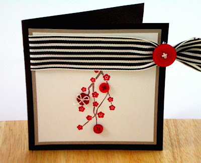
So attempt number one - I cracked out the SU Eastern Blooms set (yes.. again!) with SU Early Espresso and Kraft. The wide striped grosgrain ribbon is SU as well and my stock is seriously dwindling...

The red buttons are Pure Poppy vintage buttons from Papertrey Ink. The packs are great, they're only $5 and you get a big bag of various sizes and shapes. I just used 2 threads from a piece of kitchen twine for making the bow and stitching in the button. Thought it was a cute touch.

I've just discovered that I can't submit two cards from the same link.. so I'm about so split this post into two!

Stay tuned for attempt #2!

Saturday 9 July 2011

Little Leaves in ... winter....

Despite signing up for the Summer Card Camp, it's hard to feel summery and light when you have the onset of flu and fever my fabulous hubby shared so graciously! So as I write, I'm holed up on the couch in the lounge room in trackies, wearing my favourite slippers "hoodies for feet" which the girls call 'adult booties' just to tease me, all rugged up, and drinking a hot cuppa.  Strangely, I'm struggling to get that pesky work done, so I'm blogging instead! tee hee...

This week has been a bit nuts, so I wasn't able to make anything new, but I thought I'd post a card I made a couple of weeks ago for my friend Oli's birthday. Its in my absolute favourite colour Old Olive from SU and used together with Chocolate Chip and Kraft (sorry, I've tried to call it crumb cake, but it just doesn't float my boat!) The 'little leaves' die is super cute don't you think?.

I've used it to make a birthday card, but I think really the template could be used to make almost any card... maybe even a blank one (although there would be a glaringly empty spot right where the sentiment goes!).

I initially had the white paper plain in the background but it needed something. I tried to use the SU 'En Francais' background stamp, but it was too curly and ... well ... floral! (ironic I know, given the card has leaves on it!) 

I settled for the HA friend definition stamp. It's a modern font and gives it a little of a younger edge I thought. 

Hold your hats, I actually tied a bow! I used the ribbon to go the whole way round the front of the card given it's top folding and actually tied the two ends into a bow. It took a bit of fluffing about, and rejigging it, but got there in the end! Thank god for you tube. I've been watching tutorial after tutorial (there are benefits to being an insomniac!).  The ribbon is SU choc chip taffeta. It's very forgiving as it holds nicely but doesn't crease to much when you screw up and have to re-tie over and over! 

I liked the quirky-ness of making a top fold card that looks like a side fold card because of where the corners are rounded! Oh, and the Zig glue pen seemed not to stick the leaves down properly, so I busted out the glossy accents and just made tiny dabs here and there - worked like a charm.

Handy hint - Glossy Accents replaces super glue in our house. I've used it to bond the broom when the wooden pole came out of the wooden head, and used it to re-fix the paper towel holder to the shelf in the cupboard. Superglue and wood glue both failed. David burst out laughing when I ran up to the craft cupboard and grabbed it gleefully! I tried to use the old "see, all that money well spent" argument, but he rolled his eyes. better luck next time eh?

Enjoy your weekend, and hopefully we can all get a chance to squeeze in a little crafting!

AM x

Tuesday 5 July 2011

Wedded Bliss

Even though David and I had a wishing well for our wedding (we bought our house and had two separate return trips to Italy and got married in that same 12 month period!) I still always feel a little guilty giving people money. Somehow feels so last minute, even if it's not.

So I figure making the card is my way of saying "hey, this is a big deal and I'm putting a lot of effort into it". Problem? I'm largely a clean and simple girl, so it often doesn't look like I spent so much time on it. Check out this card for example:


I made this card for my cousin's wedding. The striped ribbon went right around the front of the card so I was able to tuck in the cash and make it part of the card. Nifty, but totally by accident! Hehe

I was kind of happy that it came out as clean and simple as it did. Finding a wedding card that's not too girly can be difficult. This was my way of keeping it unisex. (granted it did have a little flourish on the cake and some wedding rhinestone bling on the flowers!) but overall fairly plain and more about texture than colour. The fact that the card stock is linen-grained and the silver cake is embossed gives it a 'specialness' (is that even a word?) but hopefully doesn't look too plain and slapdash. What do you think?